We share 16 entrance halls that leave an impression.
The idea that an entrance hall should be a statement-making introduction to your home – a clue to what lies beyond – is a familiar one. They are a first ‘embrace’, a warm welcome, and should even cause you (and your guests) to want to delay departure. We explore a few entrance halls that challenge the notion that these traditionally transient spaces are a room to just rush through between surfing lessons and homeschooling.
ARCHITECTURAL
From simple hellos to dramatic entrances… In some spaces the interior architecture speaks volumes, so the décor doesn’t have to work as hard. Whilst, in others the decoration enhances the architecture and, in some cases, even adding heightened drama to the space.
Julia Day adds a few simple, yet iconic, pieces to this generously-sized entrance hall. She displays her knack for letting strong architecture, in this case by Jo van Rooyen, be the hero. The wooden screen – an artwork by Karel Nel entitled ‘Separation of the Water on Non-entity’ – effectively breaks up the double volume wall (photography: Elsa Young).
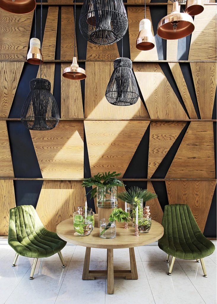
LEFT: Simplicity reigns in this Sydney interior by Tamsin Johnson. The architecture and décor complement rather than interrupt. RIGHT: For this double-volume hallway, Johannesburg-based designer Mumtaz Dasoo created floor to (almost) ceiling panelling for the walls. Further spectacle is offered in the arrangement of a collection of pendant lights at varying heights.
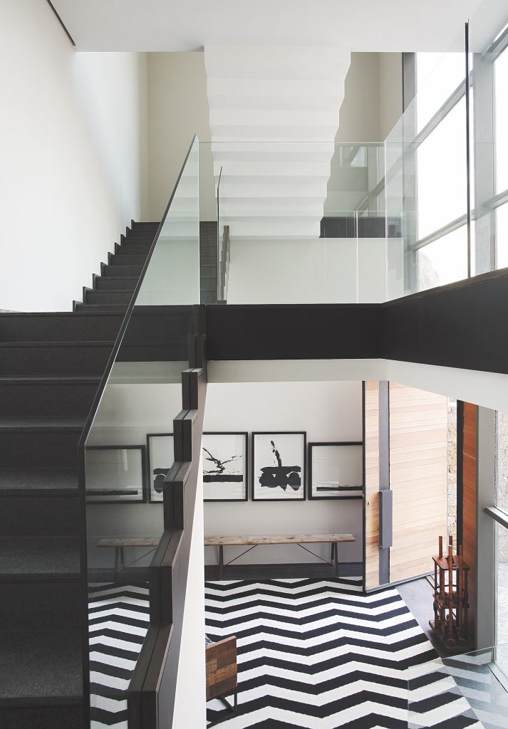
Interior designer Sumari Krige has echoed the architectural theatre of this entrance with a large zigzag patterned rug. The repetition of the monochromatic palette also adds to the effect.
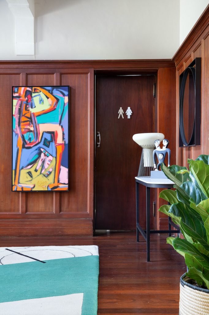
The obviously modern decorative pieces in this entrance are a satisfying juxtaposition to the period architecture of a family home. We’re fans of how the modern elements are pulled together with black linear lines (image credit: Vignette Content Agency).
DECORATED
Group hugs, old friends and new beginnings… Curated collections – from art and mirrors to ceramics and objects – are a personal expression that also create a common design thread. Plus, they’re always a talking point. When old and new come together, they often produce an interior that is better than the sum of their parts. Entrances that get the mix right feel elegant, playful, nostalgic and textured.
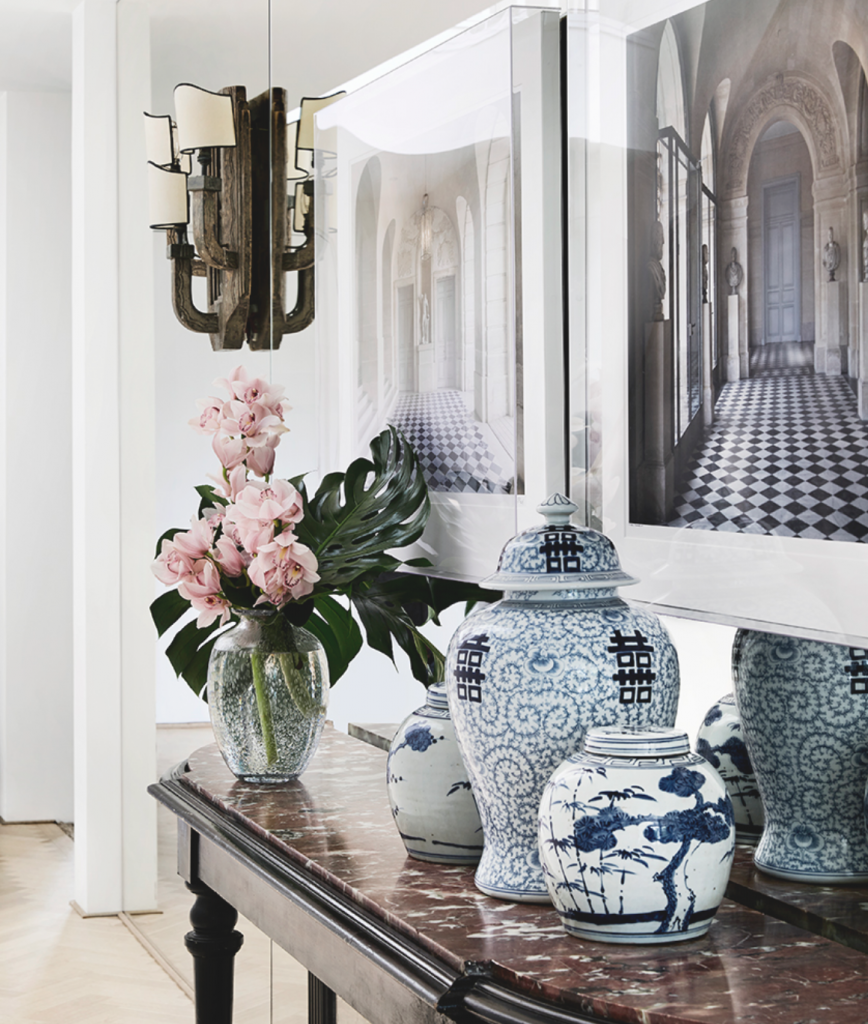
A small collection of blue and white ceramics grace this elegant entrance hall by Tamsin Johnson.
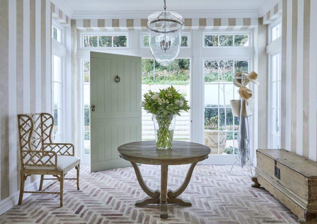
In this entrance hall by Gregory Mellor, the patterned klompie brick floor and striped walls offset the hallway table, chair and chest (combining old with new but in matching natural tones).
LEFT: Lemon’s ‘Ashby’ table takes centre-stage in this entrance hall styled by Sanri Pienaar. The table is paired with other modern pieces (sporting vintage silhouettes) as well as original antiques (photography: Inge Prins). RIGHT: A newly built Hamptons home, by US designer Robert Stilin, marks the passing of time. In this entrance he’s used an oxidised mirror with a 1940s console (image credit: 1stDibs).
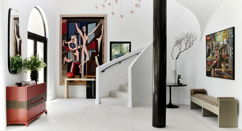
This gracious entrance foyer acts as a mini art gallery for the celebrity homeowner. Interior designer Deborah Wecselman incorporated various custom furniture and decorative pieces including the vibrant red cabinet and Bocci pendant lights (image credit: Architectural Digest with photography by Douglas Friedman).
FUNCTIONAL
Hardworking hallways… Besides the conventional functionality of entrance halls and landings (a place for coats, boots, car keys and the like), they are often required, whether gracious or compact, to work harder than expected.
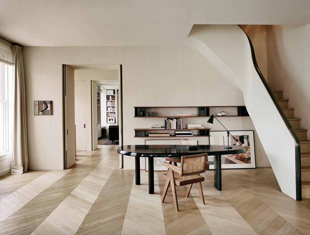
Whilst strictly not an entrance hall, this landing in a New York interior, by Vincent Van Duysen, shows how the generous space at the foot of a staircase is used as a home office. Given the area’s prominence in the overall décor scheme, sculptural pieces of furniture (including a Charlotte Perriand table and Pierre Jeanneret armchairs) have been employed for both practical and aesthetic reasons.
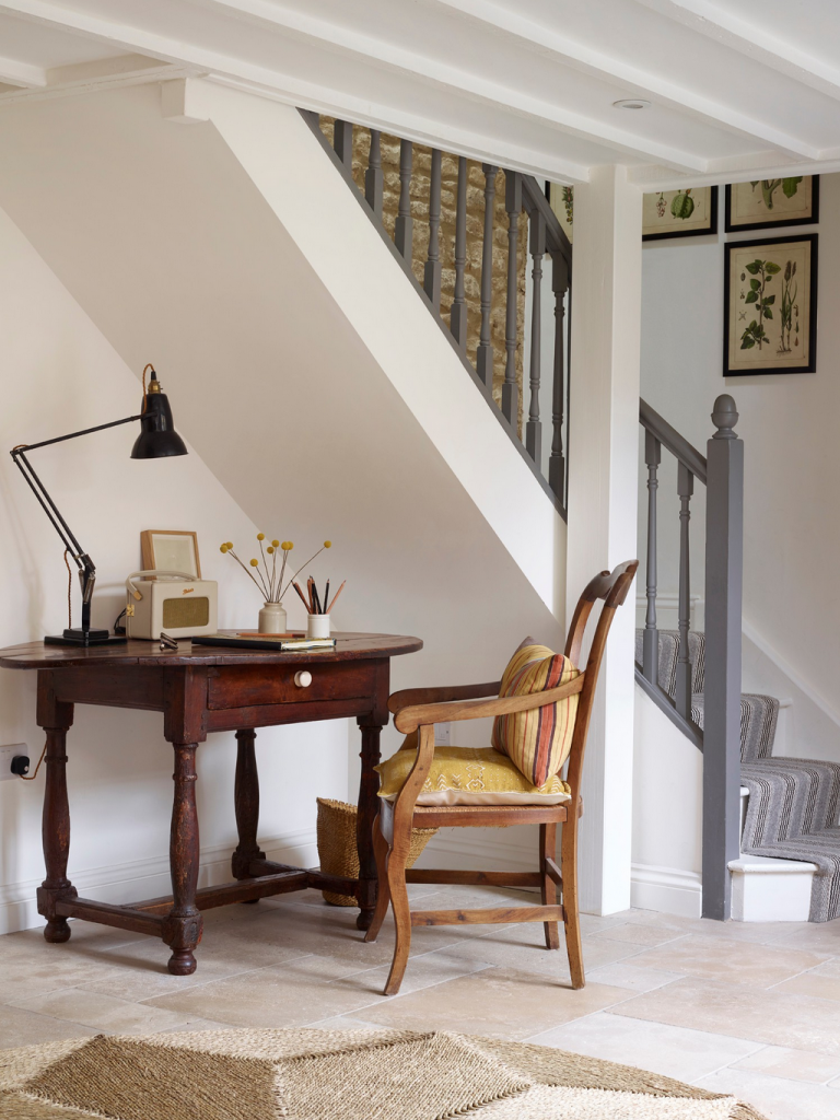
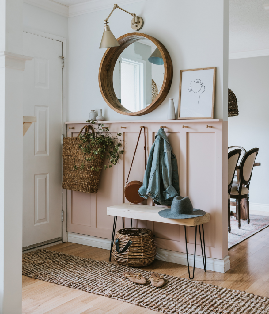
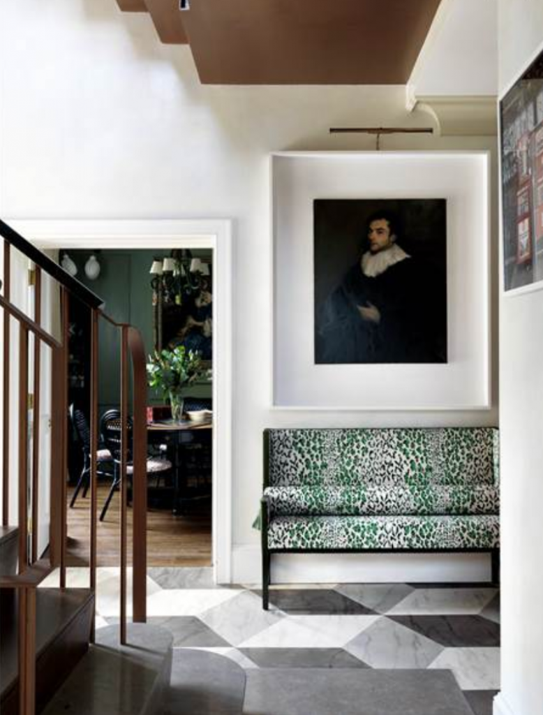
LEFT: In this Cotswold cottage, British designer Jo Shore makes use of an area off the entrance hall to create a quirky home office. RIGHT: This entrance, by interior designer and blogger Jessica-Sarah Morris, shows that a functional space can also be a pretty one. Her use of wall-panelling and handy pegs is intriguing – as are most of her decorative choices! The upholstered bench, basket and wall mirror are all beautifully useful.
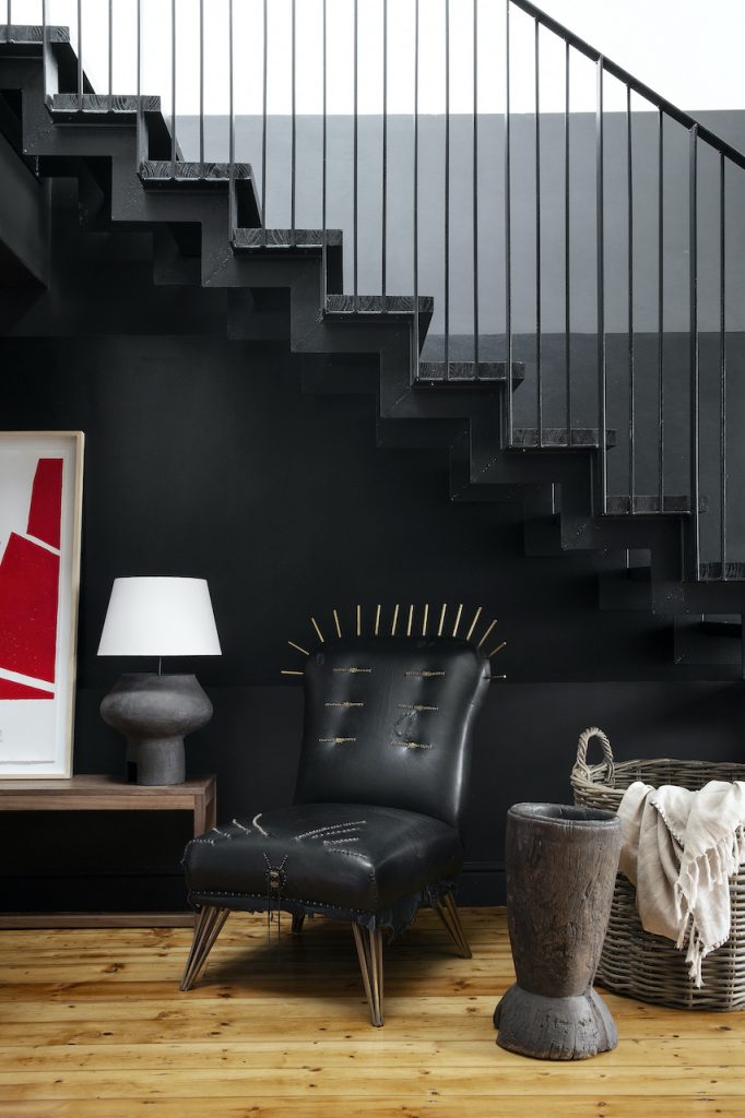
In the hallway of this home by Hendre Bloem a mix of materials (leather, clay, wood and woven), and a surprise item (notice the crown of spikes on the armchair), adds heaps of interest. There is also functionality: the wooden urn for umbrellas, walking sticks and the like; the basket for things like shawls; and the chair as a perch for pulling on shoes.
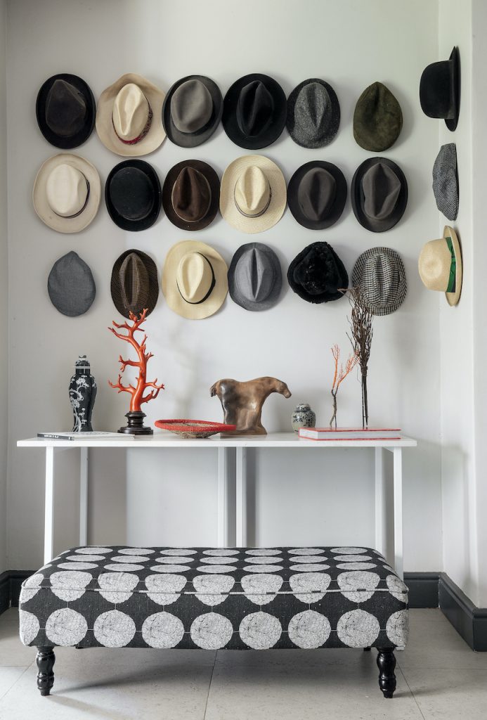
LEFT: Hats grouped together as a display prove to be a principal focal point – as well as a clever storage solution (image credit: Vignette Content Agency). RIGHT: In this hallway interior by Beata Heuman, a traditional painting gets a modern frame, whilst a bench-style seat makes for somewhere to perch.
Words and production: J-P de la Chaumette Images: Supplied and as credited with hero image courtsey of La Grange Interiors and home page slider image by DOuglas Friedman for Architecural Digest