The reign in Spain
For Noē Prades, a rising star of Iberian design, decorating with noble intentions means a respect of histories both natural and cultural.

When recently asked to describe himself as an item of furniture, Barcelona interior designer Noē Prades likened himself to Ingo Maurer’s 1970s creation, the Uchiwa lamp. “It’s a sculptural and poetic piece made from natural materials – bamboo, wicker and Japanese rice paper,” he says of the comparison. In many ways these characteristics – sculptural, poetic and natural – aptly describe Noē’s body of work. Heavily inspired by his travels, by ancient cultures and the botanical kingdom, Noē’s projects are fast being noticed, and have graced the covers of Spanish Architectural Digest. He’s also been included by the magazine in this year’s annual AD100, a collection of designers recognised for their creative excellence. We chatted all things design with Noē and asked him to elaborate on the thinking behind some of his bolder spaces.
I grew up a curious boy. There is something in design, and in creating environments, that I have always been passionate about. I was born and raised in Catalonia, and my passion for design was noticeable when I was little. My father worked in construction, so I was surrounded by spaces in which I could imagine placing my own furniture and decorative objects. With such artistic interests it’s no wonder I later studied design at the University of Barcelona.
I understand design as a way of life. I am always observing, searching and imagining. I started my practical studies before finishing my degree. I was renovating my house and some friends, impressed by the outcome, commissioned me to work on their homes. And so, I grew and developed professionally, eventually establishing my own studio.
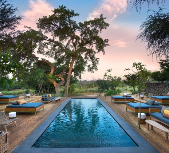
Wherever I walk in Barcelona I notice architectural details that flood the city. It is pure inspiration to walk the streets, as they are full of design. As is the rest of Spain, and because it isn’t a very big country, the aesthetic differences I notice from north to south and from east to west are all the more incredible.
I hope to stir up sensations in the interiors I design. I always begin with a concept, an idea that allows me to develop a style that conveys emotion, and that generally references nature. My style can be defined as eclectic – it has a touch of the Mediterranean, but I also hope that the spaces I create transport their inhabitants to other cultures and geographies.
The merging of nature and architecture inspires me. Since my last trip to Mexico, I have closely followed the designs of Roth Architecture. I find it fascinating how their projects create fantasy, with surprises around every corner.
The pandemic has made people realise the importance of living in harmonious homes. There will be a growth in home improvements and renovations in the near future, and I hope to be part of it. I am proud of where I am today. Thanks to my efforts, I have seen my work published, which has generated more work for me, with interesting projects to come.


On the materiality of texture
Textures are a stimulus for the senses, especially for touch. I feel they convey information, and in the context of an interior, should always be taken into account at concept stage. In the image on the left above, a living room for my Indé project, the concept welcomed the use of materials including rattan, wicker and cane, the idea being to convey a sense of the tribal, of material uses mastered by Native American cultures. Texture played a fundamental role in doing so, which is why I not only used such tactile materials in the furniture, but also on the walls and door. In the living room on the right, from the Llançà project, the interior is much cooler with lighter colours and softer textures. This concept centred on purity, so the inclusion of the shaggy carpet was essential, as its tactility underfoot reminds one of textural sensations experienced for the first time in childhood.


On variations in colour
As designers, when using colour, we have to know for whom it is intended, as colour has a more significant effect on us than we generally think. Colours affect people differently, and their appearance is different from space to space, so it’s crucial to know the space and understand the light. Most clients tend to opt for neutral colours at first, so explaining concepts and showing them tests encourages them to be more daring. The dining room above on the left is from my Botanic project, a renovation of a 70 square meter apartment in a Barcelona building constructed in the mid-1890s. The wall colours I’ve used stem from the concept, which unites plants, roots, masculinity and darkness. Like in the bedroom on the right, from my Forest project in the Eixample neighbourhood and with views of Sagrada Familia, the difference in tonalities is important as it creates depth rather than a single plane of focus. The intensity of colour is used in both spaces to draw the eye to areas of interest.


On pattern play
Combining patterns is about storytelling, and so every pattern has to convey a message and its inclusion needs to be justified. The bathroom above on the left is from my Delta project, an apartment renovation that centred on the concept of a river delta – the textures, colours, vegetation, marine life and birds where a river ‘dies’. I’ve chosen floor tiles that reference the ripples and small waves of the river itself, whereas the wall tiles echo the sandy soil. My choice of wallpaper directly references the flamingos that flock to such deltas. In the second image, also from the Forest project, the concept was inspired by the beehive and honeycomb. A honey-mustard wall tone, diagonally placed wall tiles and hexagonal floor tiles all reinforce this visual.