An apartment after Le Corbusier’s own heart
A Cape Town apartment that fuses an iconic colour palette with high-end design.
Doubling up as a pied-à-terre and landing pad for business, this two-bedroom apartment in Sea Point’s Ten on Q (developed by Blok) has a few tricks up its sleeve. With a footprint of just 100 square metres, the design incorporates clean lines, lofty volume and an iconic colour palette, all of which breathe life into the space. Bought off-plan by Germany-based Lawrence Wilcox, the block attracted him for its modernist feel.
360 Design’s Anette de Jager was tasked with creating “a space with a modern mid-century design dialogue”, the challenges of which included contending with the limited footprint and injecting some personality into the space.
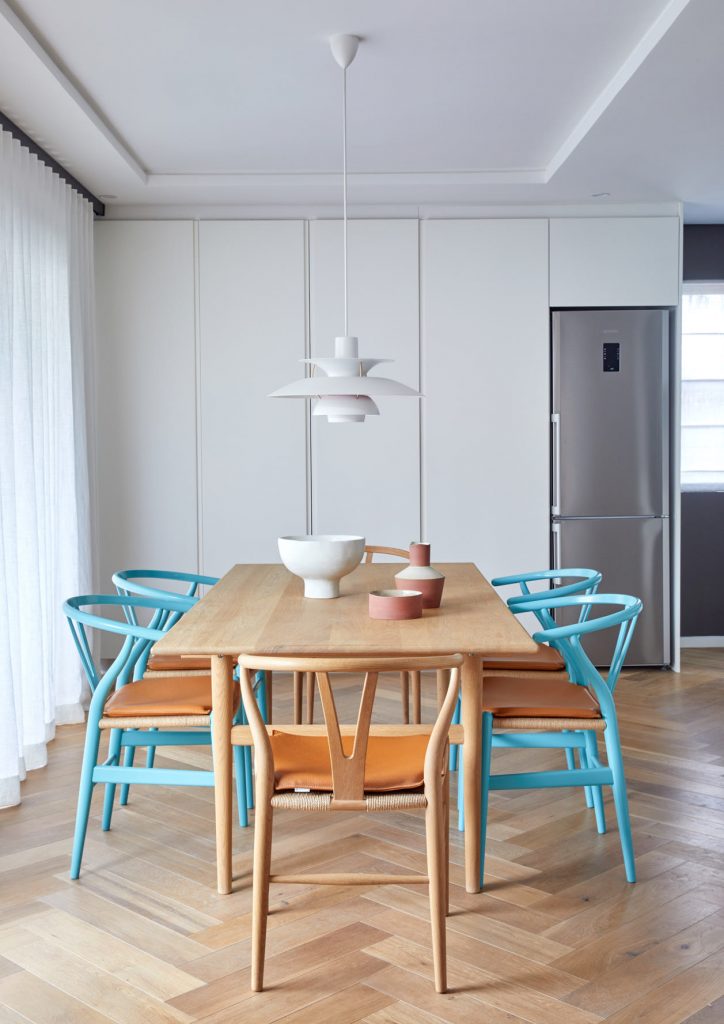
In response, Anette opted for furniture that was lean in form, maximising on the flow of light within the interior and tricking the eye into the perception of space with careful scaling. These pieces are a fusion of iconic European designs by the likes of Carl Hansen and Louis Poulsen with local designs from Greg Marshall and homeware by a host of South African talents.
As a life-long fan of modernism (particularly mid-century modern), there could be no other paint chart for Lawrence to look to than Le Corbusier’s The Architectural Polychromy. Created in the years 1931 and 1959, Le Corbusier’s original colours were put into production by Les Colours Le Corbusier and are available for the likes of you and me through Keim in South Africa.
Lawrence approached Alessandra Pisi Joncoux of Pisi Design, an architect and specialist in the Le Corbusier colour range, to create the colour scheme for the apartment. Her design has done more than add colour, it has altered the concept of space and volume throughout by reflecting the colours of Lions Head mountain and the Cape ocean, bringing with it depth and mood.
“It made sense to use these colours and bring the architectural shades to an otherwise lacklustre loft interior (paint-wise); they had the same aesthetic theme as the Danish furniture”, Lawrence reflects. If you’re going to use a celebrity paint chart, you may as well pair it with a famous painter, right? Enter Jan Ochsmann, a painter who specialises in heritage buildings and mineral paints and was one of the team involved in painting the Zeitz MOCAA. The colours themselves were selected by Parisian architecture firm Pisi Design.
A generously curved wall, rare in a modern apartment block, is a foil to the crisp lines of the open-plan kitchen; while splashes of blue and terracotta delight the eye, bringing energy into the interior. Even some of the accessories and art, as well as the Wishbone chairs tie in with the playful colour scheme. Altogether, for its small size, the apartment packs quite the punch.


blok.co.za | keim.com | 360design.co.za | pisidesign.com